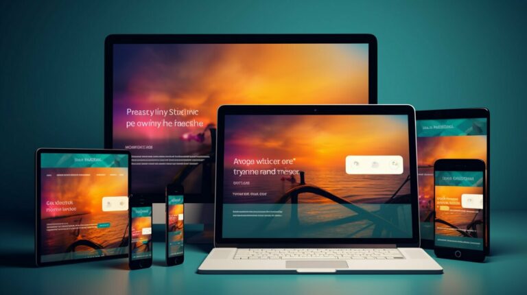
In the world of web development, creating responsive designs has become increasingly important. With more and more people accessing the internet on various devices, it’s crucial to ensure that your website looks great on screens of all sizes. This is where flexbox layout comes in.
Flexbox layout is a CSS3 module that can be used to create dynamic and flexible layouts for webpages. It allows you to align and distribute items within a container, making it perfect for creating responsive designs. In this article, we’ll provide you with a comprehensive guide to flexbox layout, from the basics to advanced techniques.
Key Takeaways:
- Flexbox layout is a CSS3 module used to create dynamic and flexible layouts for webpages.
- Flexbox can be used to align and distribute items within a container, making it perfect for creating responsive designs.
- This article will provide a comprehensive guide to flexbox layout, from the basics to advanced techniques.
Understanding Flexbox Layout
CSS flexbox is an essential tool in modern web development, allowing for greater flexibility and control over webpage layouts. At its core, flexbox is a system for organizing content within a container, using flexible sizing and positioning to create dynamic, responsive designs.
The Flex Container
To begin using flexbox, you must first create a flex container by setting the display property of an element to flex. This will convert the element into a flex container, allowing you to apply additional properties to control how its child elements are positioned and sized.
Flex Items
Once you have a flex container, you can start adding flex items. These are the child elements within the container that will be arranged according to the flexbox layout. By default, flex items will be arranged horizontally in a single row, but you can change this by modifying the flex-direction property of the container.
Flex items have a range of properties that can be used to customize their behavior within the container. For example, the flex-grow property determines how much the item will grow in relation to other items in the container, while the flex-shrink property determines how much it will shrink if the container becomes too small to accommodate all the items.
| Property | Description |
|---|---|
| flex-grow | Determines how much the flex item will grow in relation to other items in the container. |
| flex-shrink | Determines how much the flex item will shrink if the container becomes too small to accommodate all the items. |
| flex-basis | Determines the initial size of the flex item before it grows or shrinks to fit the container. |
| flex | A shorthand property that combines flex-grow, flex-shrink, and flex-basis. |
These are just a few examples of the properties that can be applied to flex items; there are many more that can be used to achieve a wide range of layout effects.
Aligning Flex Items
One of the most powerful aspects of flexbox layout is the ability to easily align flex items along the main and cross-axis of the flex container. There are several properties available to achieve different types of alignment, depending on the layout requirements.
justify-content
The justify-content property is used to align flex items along the main axis. It controls the distribution of space between and around the flex items. Depending on the value assigned, it can align items to the start, end, center, space between, space around or space evenly between the container.
| Value | Description |
|---|---|
| flex-start | Aligns items to the start of the container. This is the default value. |
| flex-end | Aligns items to the end of the container. |
| center | Centers items in the container. |
| space-between | Aligns items with equal space between them. |
| space-around | Aligns items with equal space around them. |
| space-evenly | Aligns items with equal space around them, including the edges. |
align-items
The align-items property is used to align flex items along the cross-axis. It controls the alignment of items within a flex line. Depending on the value assigned, it can align items to the start, end, center, stretch or baseline of the container.
| Value | Description |
|---|---|
| stretch | Aligns items to stretch the entire cross axis of the container. |
| flex-start | Aligns items to the start of the container. This is the default value. |
| flex-end | Aligns items to the end of the container. |
| center | Centers items in the container. |
| baseline | Aligns items to their baseline positions. |
align-self
The align-self property is used to align individual flex items along the cross-axis, overriding the default alignment set by the align-items property on the container. This property accepts the same values as align-items.
By combining these properties and adjusting the values, you can create highly flexible and customizable layouts that adapt seamlessly to different screen sizes and resolutions.
Advanced Flexbox Techniques
In this section, we will explore more advanced techniques for using flexbox to create dynamic and complex layouts. By utilizing flex-wrap, flex-grow, and flex-shrink properties, we can achieve even more flexibility and control over the design of our webpages.
Flex-Wrap
The flex-wrap property allows flex items to wrap onto multiple lines within the flex container. By default, flex items will try to fit onto a single line, but if there is not enough space, they will wrap onto a new line. This can be useful for creating responsive designs that adapt to different screen sizes or for arranging items in a more visually appealing way.
To use flex-wrap, simply set the property to “wrap” on the flex container:
    .flex-container {

      display: flex;

      flex-wrap: wrap;

    }
Flex-Grow
The flex-grow property specifies the amount of available space that a flex item should take up relative to other items. By default, each item has a flex-grow value of 0, which means it will not grow to fill any extra space. However, if we want certain items to expand and take up more space, we can give them a higher flex-grow value:
    .flex-item {

      flex-grow: 1;

    }
.flex-item.large {
flex-grow: 2;
}
In the above example, all flex items have a flex-grow value of 1, meaning they will all take up an equal amount of extra space. However, if we want the “large” item to take up twice the amount of extra space as the others, we can give it a flex-grow value of 2 instead.
Flex-Shrink
The flex-shrink property specifies the ability of a flex item to shrink if necessary. By default, each item has a flex-shrink value of 1, which means it will shrink to fit the container if there is not enough space. However, if we want certain items to be less likely to shrink, we can give them a lower flex-shrink value:
    .flex-item {

      flex-shrink: 1;

    }
.flex-item.large {
flex-shrink: 0;
}
In the above example, all flex items have a flex-shrink value of 1, meaning they will all shrink equally if necessary. However, if we want the “large” item to be less likely to shrink, we can give it a flex-shrink value of 0 instead.
Creating Responsive Designs with Flexbox
One of the major benefits of using flexbox is its ability to create responsive designs that adapt to different screen sizes. In this section, we will explore some techniques for achieving responsive layouts using flexbox.
Using Media Queries
Media queries allow you to apply specific CSS rules based on the size of the device or viewport. By combining media queries with flexbox, you can create layouts that adjust to different screen sizes.
For example, you can set breakpoints using media queries to change the flex-direction property of a flex container from row to column, which can be useful when designing for smaller screens where vertical space is limited:
“@media screen and (max-width: 600px) {
.flex-container {
flex-direction: column;
}
}”
This media query targets screens with a maximum width of 600 pixels and changes the flex-direction property of the .flex-container to column.
Flexbox Breakpoints
In addition to using media queries, you can also create flexbox-specific breakpoints using a combination of the flex-basis and flex-grow properties.
Setting the flex-basis property to a fixed value and the flex-grow property to 0 creates a breakpoint where the flex item will no longer shrink. For example:
“.flex-item {
flex-basis: 200px;
flex-grow: 0;
}”
In this example, the flex item will maintain a minimum width of 200 pixels and will not shrink below that size as the screen size decreases.
Other Techniques
Other techniques for creating responsive designs with flexbox include using the flex-wrap property to control how flex items wrap onto the next line, and using the order property to change the order of flex items for different screen sizes.
By combining these techniques, you can create fluid and responsive layouts that adapt to different screen sizes and devices.
Comparing Flexbox and Grid Layout
When it comes to creating responsive layouts in CSS, two popular options are flexbox and grid layout. While they share some similarities, there are also some key differences that make each approach more suitable for different use cases.
Flexbox
Flexbox is a one-dimensional layout model, meaning it works with either rows or columns, but not both at the same time. It’s ideal for creating flexible and dynamic layouts, as it allows you to easily align and distribute items within a container, regardless of their size or content. Flexbox is also great for creating responsive designs that adapt to different screen sizes.
Some of the key benefits of using flexbox include:
- Easy alignment of items within a container
- Flexible sizing of items based on available space
- Automatic reordering of items based on screen size
- Ability to create responsive layouts with minimal code
Grid Layout
Grid layout is a two-dimensional layout model, allowing you to create both rows and columns within a single container. It’s ideal for creating complex and structured layouts, such as those commonly found in print design. Grid layout is also great for creating responsive designs, as it allows you to specify precise positions and sizes for items based on screen size.
Some of the key benefits of using grid layout include:
- Ability to create complex layouts with multiple rows and columns
- Easy placement of items within specific grid areas
- Precise control over item sizing and spacing
- Ability to create responsive designs with precise control over item placement
Choosing the Right Layout for Your Project
Deciding whether to use flexbox or grid layout depends on the specific needs of your project. If you’re looking for a simple, flexible layout with easy alignment and responsive design, then flexbox is likely the best choice. However, if you’re creating a complex layout with multiple rows and columns, and need precise control over item placement and sizing, then grid layout may be the more suitable option.
Ultimately, both flexbox and grid layout offer powerful tools for creating responsive designs in CSS, and the best choice depends on the specific needs of your project.
Step-by-step Flexbox Tutorial
In this section, we will provide a comprehensive tutorial on how to use flexbox to create efficient layouts that respond well to different screen sizes. Whether you are new to web development or an experienced designer, this tutorial will guide you through the key concepts and techniques of flexbox.
Step 1: Setting up the Flex Container
The first step in using flexbox is to create a flex container that will hold all the flex items. To do this, you need to apply the display:flex property to the container element. You can also set other properties such as flex-direction, justify-content, and align-items to control the layout of the items within the container.
Here is an example:
<div class=”flex-container”
style=”display:flex; flex-direction:row; justify-content:center; align-items:center;”>
<div class=”flex-item”>Flex Item 1</div>
<div class=”flex-item”>Flex Item 2</div>
</div>
In this example, we have created a flex container with the class “flex-container” and two flex items with the class “flex-item”. The container has a row direction, centered justification, and centered alignment. These properties ensure that the two items are positioned in the center of the container, with equal spacing on either side.
Step 2: Adding Flex Properties to Items
The next step is to add flex properties to the flex items themselves. These properties determine how the items behave within the container and affect their size, position, and order.
Here are some of the most commonly used flex properties:
- flex-grow: Determines how much the item should grow relative to other items.
- flex-shrink: Determines how much the item should shrink relative to other items.
- flex-basis: Sets the initial size of the item before any remaining space is distributed.
- order: Sets the order in which the item appears within the container.
Here is an example of how these properties can be added to the flex items:
<div class=”flex-container”
style=”display:flex; flex-direction:row; justify-content:center; align-items:center;”>
<div class=”flex-item” style=”flex-grow:1; flex-shrink:1; flex-basis:auto; order:1;”>Flex Item 1</div>
<div class=”flex-item” style=”flex-grow:1; flex-shrink:1; flex-basis:auto; order:2;”>Flex Item 2</div>
</div>
In this example, we have added flex-grow, flex-shrink, flex-basis, and order properties to each of the flex items. These properties ensure that both items have equal growth and shrink properties, and that they keep their initial size before any remaining space is distributed. The order property ensures that Flex Item 1 appears before Flex Item 2 within the container.
Step 3: Creating Responsive Layouts with Flexbox
One of the key benefits of using flexbox is its ability to create responsive layouts that adapt to different screen sizes. To achieve this, you can use media queries to target specific screen sizes and adjust the flex properties accordingly.
Here is an example:
@media (max-width: 768px) {
.flex-container { flex-direction: column; }
.flex-item { width: 100%; }
}
In this example, we have used a media query to change the flex-direction property of the flex container to column when the screen size is smaller than 768px. We have also set the width of the flex items to 100% to ensure they occupy the full width of the screen.
Step 4: Exploring Advanced Flexbox Techniques
Once you have mastered the basic concepts of flexbox, you can explore more advanced techniques to create complex and dynamic layouts. Some of these techniques include:
- Flex-wrap: Determines whether flex items should wrap to the next line when there is no more space in the container.
- Align-content: Determines how flex lines are aligned within the container when there is extra space on the cross-axis.
- Flex-flow: Combines the flex-direction and flex-wrap properties into a shorthand notation.
Here is an example:
<div class=”flex-container”
style=”display:flex; flex-flow:row wrap; align-content:center;”>
<div class=”flex-item” style=”flex-basis:25%; margin:10px;”>Flex Item 1</div>
<div class=”flex-item” style=”flex-basis:25%; margin:10px;”>Flex Item 2</div>
<div class=”flex-item” style=”flex-basis:25%; margin:10px;”>Flex Item 3</div>
<div class=”flex-item” style=”flex-basis:25%; margin:10px;”>Flex Item 4</div>
</div>
In this example, we have used the flex-flow property to set the direction of the flex container to row and allow the flex items to wrap to the next line when there is no more space. We have also used the align-content property to center the flex lines within the container.
With these advanced techniques, you can create even more dynamic and flexible layouts that respond well to different design needs.
Mastering CSS3 Flexbox
CSS3 flexbox offers a range of new properties and enhancements that help to fine-tune layouts and improve design flexibility. Here are some of the latest features:
| Property | Description |
|---|---|
| flex-grow | This property allows flex items to grow or shrink as needed to fill available space. By default, all flex items have a flex-grow value of 0, meaning they will not grow beyond their specified width or height. |
| flex-shrink | Similar to flex-grow, this property controls how much flex items will shrink when space is limited. A value of 0 disables shrinking altogether. |
| flex-basis | This property defines the preferred size of a flex item before any remaining space is allocated. It can be set in pixels, ems, or percentages, or using keywords like “auto” or “content”. |
| flex-wrap | By default, flex items are forced to stay on a single line, even if it means overflowing the container. Setting flex-wrap to “wrap” allows items to flow onto multiple lines to prevent overflow. |
| align-content | This property controls how multiple lines of flex items are aligned within the container. It only applies when flex-wrap is set to “wrap” or “wrap-reverse”. |
These new properties, combined with the existing ones, make CSS3 flexbox a powerful tool for creating dynamic and responsive layouts. With flexbox, designers can achieve complex designs with ease, and provide a seamless user experience across devices and screen sizes.
Conclusion
Flexbox layout is an essential tool for modern web development, providing a flexible and efficient way to create responsive designs and align items on a webpage. In this guide, we have covered the basic concepts of CSS flexbox, including the flex container and flex items, as well as more advanced techniques like flex-wrap and flex-grow.
We have also discussed how to align flex items within a container using properties like justify-content and align-items, and explored how flexbox can be used to create responsive designs that adapt to different screen sizes.
While grid layout is another popular option for creating layouts, flexbox offers unique benefits and strengths that make it a valuable tool for web developers. By mastering CSS3 flexbox, designers can create more dynamic and flexible layouts that enhance user experience and engagement.
As web development continues to evolve, it is important to stay up-to-date with the latest tools and techniques available. We encourage you to continue exploring flexbox and experimenting with new ways to achieve effective and engaging layouts on the web.

